Stan Bevington and the
Early Years of Coach House Press
An adventure in printing and community in Toronto by Robert Fones
Coach House Press, founded in Toronto in 1965, is a small independent printing and publishing house that has exerted an influence on Canadian literary culture well beyond its modest size. Known for its commitment to experimental writing, innovative book design, and hands-on production, the press became central to the development of modern Canadian literature. Under the direction of its founder, Stan Bevington, it also functioned as a place where printing, design, art and literature intersected.
Stan created Coach House Press not as a conventional publisher, but as a working community, a place where printers, writers, and artists worked together to produce books. From a basement studio to a coterie of writers and visual artists, Coach House defined a uniquely Canadian approach to book printing and publishing, often encouraging authors to participate in their own book production.
In 2023, Bevington participated in a series of recorded conversations with Toronto artist and long-time friend, Robert Fones, reflecting on his early life in Alberta, his move to Toronto, and the formative years of Coach House Press, first on Bathurst Street and later at 401 (rear) Huron Street (now bpNichol Lane). Portions of the text that follows draw from those conversations.
Coach House Press has been documented by many writers, designers, and former staff members, each bringing a distinct perspective. Selected publications are listed in the bibliography. In preparing this account, Fones also contacted several individuals to clarify specific events and production processes. As with any collective history, recollections do not always align. Where accounts differ, priority has generally been given to Stan’s recollections, supplemented by published sources where available.
Formative Years in Alberta
In 1960, at age seventeen, Stan was living with his parents in Edmonton, in a house his father had built on the then Alaska Highway. Through a series of part- and full-time high school jobs, he acquired practical skills in printing, typesetting, and silk-screening that would later allow him to establish a printing and publishing venture in Toronto.
While attending evening classes at the Edmonton Art Gallery, he assisted Thelma Manarey, a local silk-screen artist, helping her construct large papier-mâché masks. This was Stan’s first introduction to silk-screen printing, a process he would repeatedly return to throughout his career.
After school he worked with Don Smith, a local architect known to his family. Smith, who had limited mobility, relied on Stan for physical assistance and introduced him to drafting, architectural drawing, and stair calculations. He also improvised a photographic enlarger from an apple juice can fitted with a camera lens, demonstrating how a lens could be used forwards or backwards as either an enlarger or camera. This makeshift device gave Stan an early understanding of photographic enlargement that he would apply extensively at Coach House Press.
Stan’s technical understanding of silk-screen printing deepened through working with Wadym Dobrolige¹, a Hungarian refugee who produced decorative patterns for Orthodox churches. Dobrolige helped Stan refine his control of the process. In turn, Stan shared his growing knowledge of photography. Applying what he had learned, Stan began producing small, printed works, including posters, combining image and text within a single process.
His first sustained exposure to typography came as a copy boy at the Edmonton Journal. While delivering punched paper tape and teletype printouts to the editorial room, he spent quiet moments studying type specimen books in the paper’s library. There he encountered the type designs of W. A. Dwiggins² and was drawn particularly to Caledonia, Eldorado, and Electra. He also admired Dwiggins’ carved marionettes and sensed a connection between their construction and the structure of letterforms.
Dwiggins carved his marionette faces with sharp planes and flat cuts; his typefaces carried similar angular energy produced through hand-cut stencils.³ Although Stan would later experience this directly through his own letter carving, the idea helped shape how he began thinking about the anatomy of type.
That interest became practical during a summer job at the Edson Leader, a small-town newspaper where he learned to operate the Linotype machine. Unlike a typewriter keyboard, the Linotype keyboard is arranged by letter frequency and required considerable practice to master. The shop also contained a darkroom and silk-screen facilities, reinforcing his familiarity with multiple stages of production.
As editor of the school yearbook at Ross Sheppard High School, he designed the school logo and supervised typesetting on the Linotype. One year, while reviewing examination papers, he noticed a thin vertical line appearing in every fifteenth printed ‘e’. Recognizing the same machine had been used for both exams and yearbook, he traced the problem to a damaged matrix, an early demonstration of his attention to typographic detail.
While still in high school, Stan was already paying close attention to the type he was reading. Curious about the typeface used in a Shakespearean play, he took the time to find out that it was Monotype Bembo. Later he would use Bembo for the first Coach House imprint, Man in a Window by Wayne Clifford. He also studied Art Directors annuals where he encountered the Isaacs Gallery logo designed by Jim Donoahue, a modernist logo that made a lasting impression. Years later in Toronto, he would print invitations for the gallery, featuring the mark he had first admired as a student.
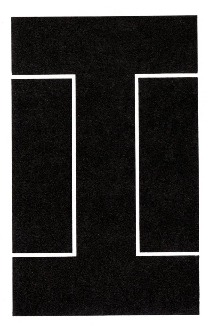
The Isaacs Gallery logo, designed by Jim Donoahue in 1962. The slab-serif ‘I’ reflects a careful balance of proportion and restraint. Founded by Av Isaacs in 1955, the gallery was a central force in Canadian art.
After graduating high school in 1961, Stan went to work at a corrugated box factory where he drew and carved large letterforms in rubber for printing on cardboard. He used ruling pens and cutting tools to make the letters. The work required precise spacing and consistency, skills closely aligned with typography.
In March 1962 he accepted a position as a Linotype operator at the Fairview Post in Fairview, Alberta. The shop’s extensive collection of type specimen books included The Encyclopedia of Type Faces. He became particularly interested in Czechoslovakian type designs and wrote directly to the Grafotechna4 foundry requesting his own specimen book, an early sign that his curiosity extended beyond his immediate surroundings.
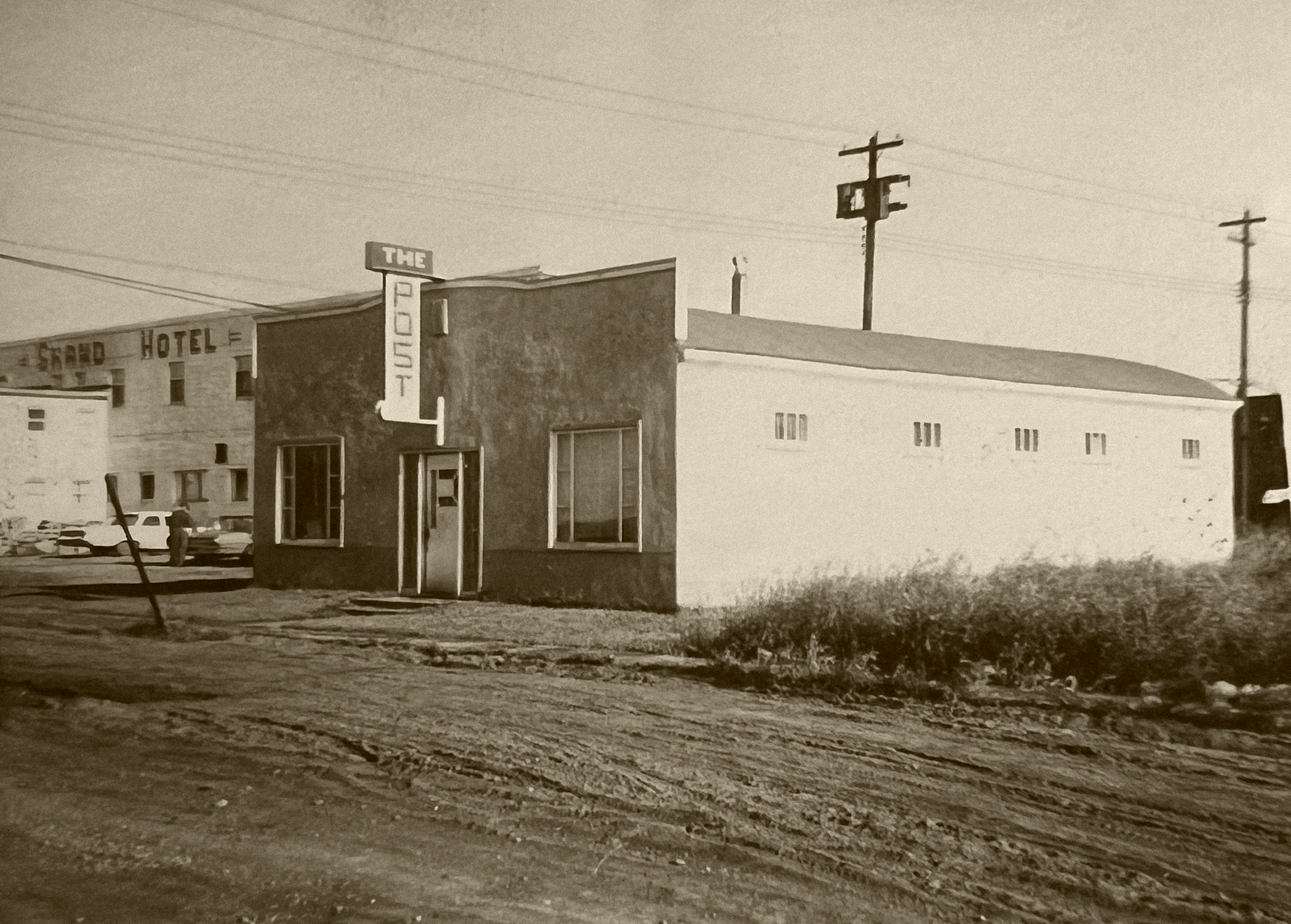
Office of the Fairview Post, where Stan first worked as a Linotype operator. Founded in 1940 by Hec MacLean, a former sportswriter for the Calgary Herald.

Article
Formative Years in Alberta
Toronto and Bevington Graphics
• Ontario College of Art
• The Flag Project
The First Coach House Press – 317B Bathurst Street
• A Shop Begins to Form
• First Imprint: Man in a Window (1965)
•Expansion
The Second Coach House – 401 Huron Street (rear)
• “We Just Tried Everything”
• Tools, Materials and Production
• Postcards – Beyond the Book
• A Turning Point
Robert Fones: Artist and Author
Robert Fones is a visual artist born in London, Ontario, in 1949. Working across photography, sculpture, painting, and publishing, he has exhibited throughout Canada and internationally, including in the United States and Germany.
Fones moved to Toronto in 1976, when the Carmen Lamanna Gallery began exhibiting his work. Through the gallery, he became associated with Coach House Press and its founder, Stan Bevington. He has since published numerous artists’ books with Coach House Press and Art Metropole. One of these, Head Paintings, was typeset in Fones-Caslon, a typeface he designed specifically for the publication. His interest in typography also appears throughout his visual work.
In 1999, Fones received the Toronto Arts Award for Visual Art. His work is held in the collections of the National Gallery of Canada, the Art Gallery of Ontario, and other public and corporate institutions. He is represented by Olga Korper Gallery in Toronto.
An active participant in Toronto’s arts community, Fones has served on the boards of the Art Gallery of Ontario and the C Magazine Foundation, as well as on the Acquisitions Committee of the Design Exchange. He curated an exhibition on Toronto furniture designer Russell Spanner for The Power Plant in 1990 and Cutout: Greg Curnoe, Shaped Collages 1965–1968 for Museum London in 2011.
Fones has taught at the Ontario College of Art and Design, the University of Toronto’s Faculty of Architecture, Landscape, and Design, and Sheridan College’s Art and Art History program.
To view his work and learn more, visit www.robertfones.com/